- 2025
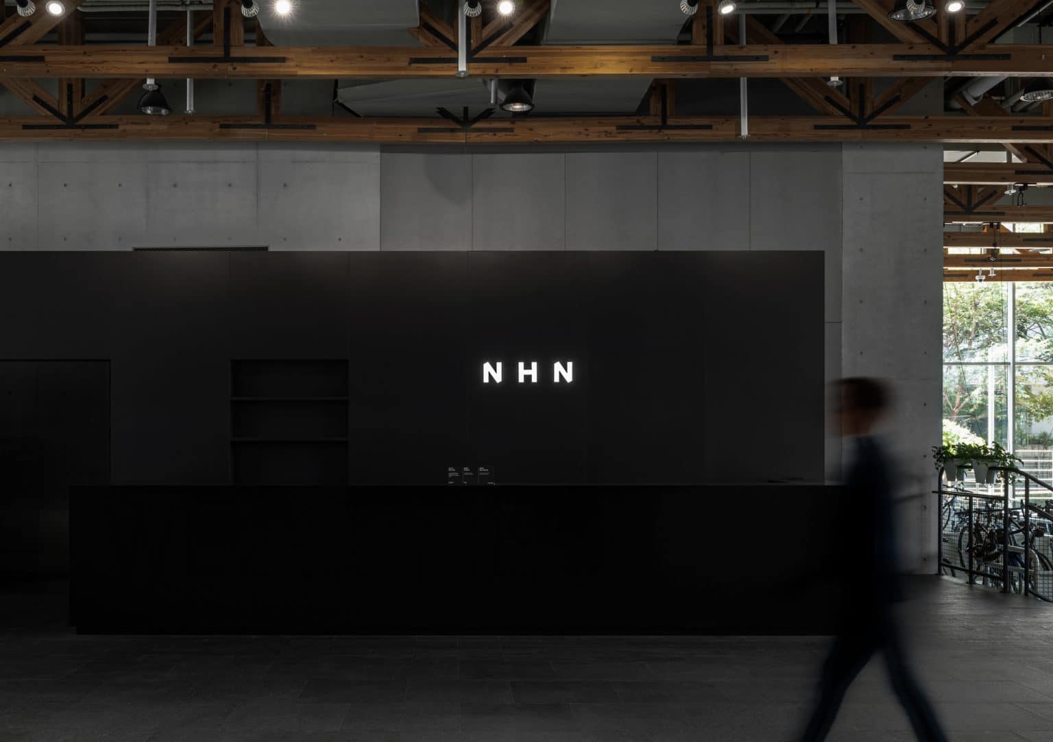
To break away from conventional design approaches that IT companies usually take, NHN collaborated with an art director. They integrated the playful concept of ‘origami’ into NHN’s brand design, ensuring that it resonates with NHN’s diverse subsidiaries and service users. This concept led to the formation of the letters ‘N’ and ‘H’, symbolizing connectivity, scalability, and infinite possibilities. NHN moved beyond the fixed color schemes commonly used by IT companies, adopting a monochromatic palette which allowed seamless adaptation across both online and offline environments. This rebranding conveys NHN’s commitment to continuous innovation endeavors and global market expansion. Just as origami creates various forms through folding, NHN’s flexible brand design allows it to adapt and thrive in the rapidly evolving digital landscape. NHN is committed to strengthening its position as a global IT frontier, continuously driving innovation through creativity and technology through such rebranding.